Choosing a paint finish for imperfect walls isn’t a compromise; it’s a strategic design decision for achieving optical flawlessness.
- Matte paint’s power lies in its microscopic texture, which absorbs light to diffuse imperfections and enrich color depth.
- True success requires specific techniques for application, touch-ups (feathering), and cleaning (dabbing, not rubbing) to prevent “burnishing.”
Recommendation: Embrace matte paint not as a cover-up, but as a foundational element for a sophisticated, calm, and gallery-like home identity.
The quiet frustration of seeing every tiny bump, roller mark, and plaster imperfection on a freshly painted wall is familiar to many homeowners. You followed all the steps, but the light catches the surface just so, revealing a landscape of flaws you hoped to conceal. The common advice is a simple trade-off: choose satin for durability or matte to hide imperfections. This binary choice, however, overlooks the sophisticated science and technique behind a truly high-end finish.
The solution isn’t just picking a can of matte paint; it’s about understanding and mastering its unique properties. The secret to transforming an uneven wall into a smooth, velvety canvas lies in the physics of light absorption, the precision of professional application techniques, and a disciplined approach to maintenance. A matte finish is not a compromise for durability but a deliberate choice for depth, richness, and visual tranquility. It requires more knowledge, but the reward is a finish that looks and feels intentional and luxurious.
This guide moves beyond the basics. We will explore the optical science that makes matte paint so effective, detail the professional methods for flawless touch-ups and cleaning, and ultimately reframe your choice of paint finish as a foundational decision for your home’s entire design identity. By the end, you will see matte paint not as a problem-solver, but as a powerful tool for sophisticated design.
To help you navigate this expert approach, this article is structured to build your knowledge step-by-step. The following sections will guide you from the underlying science to the practical techniques needed to achieve a perfect matte finish.
Summary: Matte vs. Satin for Flawless Walls
- Why Matte Paint Makes Dark Colors Look Richer and deeper?
- How to Touch Up Matte Walls Without Leaving a “Flashing” Mark?
- Washable Matte vs Standard Matte: Is the Extra Cost Justified for Kitchens?
- The Cleaning Mistake That Polishes Shiny Spots onto Your Matte Wall
- When to Remove Painter’s Tape to Get a Razor-Sharp Line on Matte Surfaces?
- Why Carrying One Accent Color Through Every Room Calms the Mind?
- Why Texture Hides Uneven Plaster Better Than Flat Paint?
- How to Define Your Home’s Design Identity Before Buying a Single Piece of Furniture?
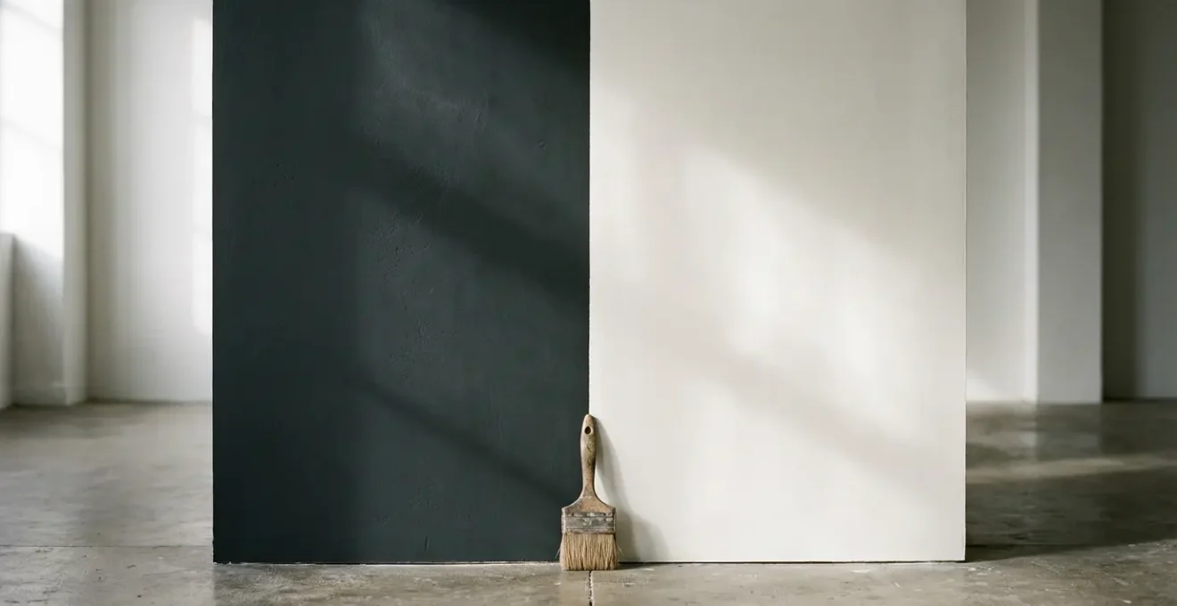
Why Matte Paint Makes Dark Colors Look Richer and Deeper?
The superior ability of matte paint to both hide flaws and enrich color lies in a single physical property: surface microroughness. Unlike a satin or gloss finish, which is smooth at a microscopic level, a matte surface is composed of countless tiny, irregular angles. When light hits this textured surface, it doesn’t reflect back in a single, uniform direction. Instead, it scatters and is largely absorbed. This phenomenon is known as optical diffusion.
This light absorption is what makes dark colors appear so profoundly deep and velvety. A satin finish, by contrast, reflects a significant portion of light, which can create a sheen that washes out the color’s true saturation. Studies show that while satin reflects a good amount of light, matte finishes absorb most of it, with only 5-10% being reflected back. By minimizing reflection, a matte finish allows the pigment to be the star, presenting the color in its purest, most saturated form.
For a homeowner with a penchant for dramatic, deep hues like navy blue, forest green, or charcoal gray, a matte finish is non-negotiable. It creates an immersive, gallery-like quality where the walls recede, making the color itself the primary experience in the room. This lack of distracting glare ensures the mood set by the color remains consistent from every angle and in every lighting condition, from bright daylight to soft evening lamps.
How to Touch Up Matte Walls Without Leaving a “Flashing” Mark?
The very microroughness that gives matte paint its beauty also makes it notoriously difficult to touch up. When you apply new paint over an old matte surface, you’re essentially smoothing over that microscopic texture in one spot. This repaired area reflects light differently, creating an unsightly shiny patch known as “flashing.” Achieving an invisible repair is a matter of technique, not luck.
Professional painters use a specific method to blend new paint into the existing finish seamlessly. It begins with using the exact original paint—not a new color-matched can—to ensure the porosity and chemical makeup are identical. The key is the feathering technique, which creates a gradual, invisible transition between the old and new paint.
Professional Insight: The Feathering Technique for Invisible Matte Touch-Ups
Insights from Mark’s Painting professionals highlight a critical process. First, they vigorously mix the original paint to ensure pigments are evenly distributed. Then, using a small artist’s brush or the corner of a roller, they apply a minimal amount of paint directly to the center of the blemish. Crucially, they then work outwards from the center, using a progressively drier brush to “feather” the edges, blending the new paint into the old texture until there is no discernible line.
This paragraph introduces a complex concept. To well understand it, it is useful to visualize its main components. The illustration below breaks down this process.
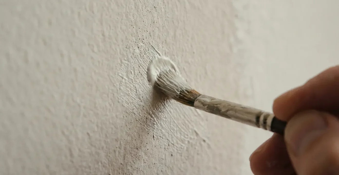
As this visual demonstrates, the goal is not to cover the area but to integrate into it. By focusing the paint on the core of the damage and thinning it out towards the edges, you replicate the original paint’s texture rather than creating a new, smooth layer on top of it. This meticulous process is the only way to avoid the dreaded flashing effect and maintain the wall’s uniform, flawless appearance.
Washable Matte vs Standard Matte: Is the Extra Cost Justified for Kitchens?
Historically, the biggest drawback of matte paint was its poor durability and washability, relegating it to low-traffic ceilings and bedrooms. Any attempt to clean a scuff mark often resulted in permanent burnishing. However, paint technology has evolved significantly, leading to the creation of “washable” or “scrubbable” matte formulas. These advanced paints are engineered with tighter, more resilient binder resins that protect the pigment particles without adding sheen.
This innovation closes the gap between aesthetics and practicality. A washable matte finish allows homeowners to bring that sophisticated, velvety look into higher-traffic areas like family rooms, hallways, and even kitchens, without the constant fear of irreversible marks. While these formulations come at a premium price, the investment is often justified by the expanded design possibilities and reduced long-term maintenance anxiety.
For a kitchen backsplash or a busy hallway, a washable matte provides the best of both worlds: the flaw-hiding, light-absorbing properties of a traditional matte with durability that approaches an eggshell or satin finish. This is confirmed by industry leaders who have spearheaded this technology. As Helen Shaw, the Director of Marketing at Benjamin Moore UK, states in an article for Homes & Gardens:
Matte finishes are nearly as shine-free as flat, providing excellent hide and depth of color. Matte finish paint also withstands frequent washing, even when applied in busier areas like hallways and family rooms.
– Helen Shaw, Director of Benjamin Moore
Ultimately, the decision depends on the specific location and lifestyle. For a formal dining room, a standard matte may suffice. But for a kitchen where splashes and smudges are a daily reality, the extra cost of a washable matte formulation is a wise investment in preserving both the beauty of the finish and your peace of mind.
The Cleaning Mistake That Polishes Shiny Spots onto Your Matte Wall
Even with the most durable washable matte paint, there is one cleaning mistake that will irrevocably ruin the finish: rubbing. The act of scrubbing or applying firm pressure with a cloth or sponge, no matter how soft, physically alters the wall’s surface. This friction flattens the paint’s microroughness, effectively polishing it to a smoother, shinier state. This effect, known as burnishing, is permanent.
Once a spot is burnished, it will catch the light and appear as a shiny patch, much like a bad touch-up job. The damage is not a stain; it’s a change to the physical structure of the paint finish itself. This is why aggressive cleaning is the number one enemy of a matte wall. The professional advice is unanimous: gentle blotting is the only safe method. Because, as experts warn, this constant rubbing results in permanent burnishing, changing the appearance of the finish.
To safely clean a matte wall without causing damage, a strict protocol must be followed. It requires patience and the right materials. The goal is always to lift the stain off the surface, not to scrub it away. Using anything abrasive, from a magic eraser to the “scrubby” side of a sponge, is a guaranteed way to create a burnished spot that is often more noticeable than the original stain.
Action Plan: Proper Matte Wall Cleaning Protocol to Prevent Burnishing
- Assess the Tool: Use only soft, clean microfiber cloths. Never use paper towels, abrasive sponges, or any rough materials that can scratch the finish.
- Use a Mild Agent: For stubborn stains, dampen the cloth with water and add a single drop of mild, clear dish soap. Avoid harsh chemical cleaners.
- Blot, Don’t Rub: Gently dab or blot the stain with the damp cloth. Apply minimal pressure. The goal is to lift the stain, not grind it into the paint.
- Rinse Gently: “Rinse” the area by dabbing it with a separate microfiber cloth dampened only with clean water to remove any soap residue.
- Air Dry: Allow the spot to air dry completely. Do not wipe it dry, as this can also cause minor burnishing.
When to Remove Painter’s Tape to Get a Razor-Sharp Line on Matte Surfaces?
Achieving a perfectly crisp, razor-sharp line between two colors or between a wall and trim is a hallmark of a professional paint job. With matte paint, the timing of the tape removal is absolutely critical. If you pull it too early, the wet paint can bleed under the tape. If you pull it too late, the paint creates a solid film over the tape, and as you pull the tape away, it can tear chunks of the fresh paint off the wall, ruining your clean line.
Professionals work within a specific window of time to guarantee a perfect result. This isn’t about waiting for the paint to be fully dry. Instead, it’s about waiting until the paint is just tacky to the touch but no longer wet. This ensures the paint has adhered to the wall but has not yet formed a brittle, continuous film with the tape.
Professional Timing: The “Tacky, Not Wet” Window for Tape Removal
According to guidance from Sherwin-Williams professionals, the ideal moment for tape removal on matte paint is typically 30 to 60 minutes after application. They emphasize not just the timing, but the technique: pull the tape slowly back on itself at a 45-degree angle. This creates a shearing force that cleanly cuts the paint along the tape’s edge. If you’ve waited too long and the paint is completely dry, they advise lightly scoring the seam between the tape and the wall with a utility knife before removal to prevent the paint film from tearing.
This precise combination of timing and technique is what separates an amateur finish from a professional one. The 45-degree angle is not arbitrary; it prevents the tape from pulling the paint straight up and away from the wall. Instead, it encourages a clean break right at the edge, leaving behind the sharp, satisfying line that defines a high-quality paint job. For homeowners seeking that flawless, high-end look, mastering this step is as important as the paint choice itself.
Why Carrying One Accent Color Through Every Room Calms the Mind?
A cohesive home design feels intentional, calm, and unified. One of the most effective and sophisticated strategies for achieving this is to create a “color thread”—a single accent color that is carried, in varying amounts, through every room. This visual repetition acts as a guide for the eye, connecting disparate spaces and creating a sense of narrative and flow throughout the home. It subtly tells your brain that everything belongs together.
The choice of finish for this accent color is critical to its psychological effect. A glossy accent color would shout for attention, creating jarring pops of high energy. A matte finish, however, does the opposite. Because it absorbs light, a matte accent color feels grounded, quiet, and integrated. It doesn’t compete for attention; it provides a consistent, calming backdrop that unifies the home’s design. This is because, as design experts note that a matte finish absorbs the most light, which enhances visual continuity and creates a less distracting, more cohesive environment.
This concept is best visualized in practice. Imagine a deep, matte forest green used as a feature wall in the living room. The eye registers it, and then, looking through a doorway, sees the same color on the back of a bookshelf in the hallway. Further on, it might appear on the front door or a single piece of furniture in the dining room. The effect is subtle but powerful.
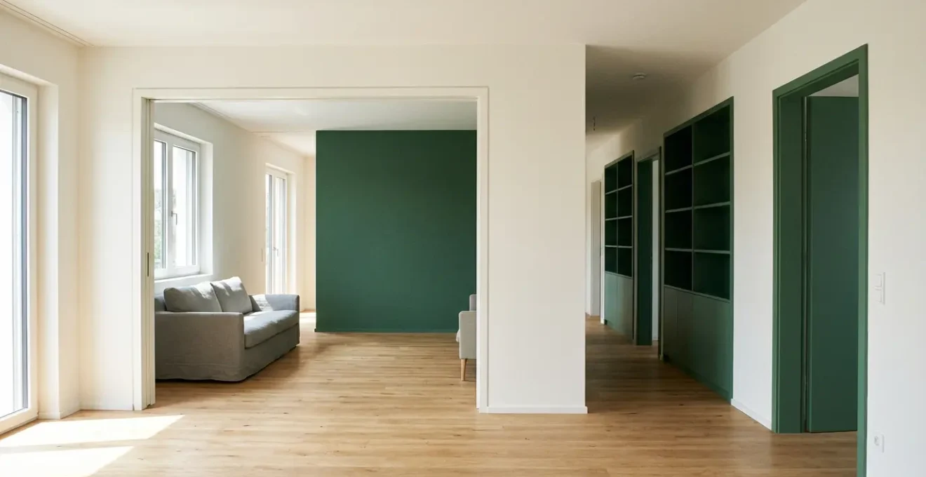
As you can see, the matte finish prevents the accent color from feeling overwhelming. It becomes a sophisticated, unifying element that adds depth and character without creating visual chaos. It calms the mind by providing a predictable and harmonious visual journey, turning a collection of rooms into a single, thoughtfully designed home.
Why Texture Hides Uneven Plaster Better Than Flat Paint?
The primary reason homeowners choose matte paint is for its unparalleled ability to conceal surface imperfections. This is not magic, but physics. Imperfections like bumps, nail pops, or uneven plaster are most visible when they cast tiny shadows or create highlights. A satin or gloss finish, which reflects light directionally, acts like a spotlight, accentuating every peak and valley on the wall. A matte finish, with its light-absorbing texture, does the opposite. It diffuses incoming light in all directions, effectively canceling out the small shadows that make flaws visible.
However, for walls with significant texture issues or old, uneven plaster, matte paint alone is only part of the solution. To achieve a truly smooth, high-end look, professionals employ a two-step system that addresses both the physical and optical aspects of the problem.
Professional Strategy: The Primer-and-Paint System for Flaw Concealment
Painters from CertaPro report that the most effective method involves surface preparation before the matte topcoat is even considered. They first apply a high-build or surfacer primer. This type of primer is much thicker than standard primer and is specifically designed to fill in minor crazing, small bumps, and other surface irregularities, creating a physically smoother canvas. Once sanded lightly, this new, more uniform base is then painted with a high-quality matte finish for maximum optical diffusion. This combination provides vastly superior results compared to simply applying multiple coats of matte paint over a flawed surface.
This systematic approach is the key to transforming a problematic wall. It separates the task into two distinct goals: first, physically leveling the surface with a high-build primer, and second, optically concealing any remaining minor variations with matte paint. Following this process is the surest way to get that coveted smooth, flawless finish.
Your Action Plan: Maximizing Imperfection Coverage
- Assess the Surface: Use a portable light held at a low angle (“raking light”) against the wall to reveal the full extent of all bumps, dents, and uneven areas.
- Apply a High-Build Primer: Select a “surfacer” or “high-build” primer and apply an even coat over the entire wall, focusing on filling minor imperfections.
- Sand for Smoothness: Once the primer is fully dry, lightly sand the surface with fine-grit sandpaper (220-grit) to knock down any ridges and create a perfectly smooth base.
- Apply the First Matte Coat: Use a quality roller with the appropriate nap length for your wall texture (e.g., 3/8″ for smooth walls) to apply the first coat of high-quality matte paint.
- Apply the Second Coat: For optimal uniformity and to eliminate any roller marks, apply the second coat in a direction perpendicular to the first (e.g., first coat vertical, second coat horizontal).
Key Takeaways
- Matte paint’s ability to hide flaws comes from its microscopic texture (microroughness) which absorbs and diffuses light.
- Proper maintenance of matte walls requires dabbing or blotting, as rubbing will permanently polish the surface (burnishing).
- For a truly flawless finish on imperfect walls, use a high-build primer to physically smooth the surface before applying a matte topcoat for optical concealment.
How to Define Your Home’s Design Identity Before Buying a Single Piece of Furniture?
Choosing a paint finish should not be an afterthought or a purely practical decision. It is one of the first and most fundamental choices you can make to define your home’s core design identity. Long before you choose a sofa or a dining table, the way your walls interact with light sets the entire mood and character of your space. A high-gloss wall communicates drama and energy; a satin wall speaks to practical elegance. A matte wall, however, establishes an identity of quiet sophistication and calm.
This idea is central to a holistic design approach. As one expert in professional design guidelines suggests, you should “Position paint finish as a foundational identity choice, not an afterthought. A ‘Matte Identity’ home embraces natural light and creates a calm, gallery-like space where objects and people are the focus.” Choosing matte is a declaration that you value texture over shine, depth over reflection, and tranquility over stimulation. It’s a choice that says the art on the walls, the people in the room, and the view out the window are the features, and the walls are the perfect, non-distracting canvas for them.
This is why matte finishes are a timeless choice for many designers and are not “out of style.” They are foundational to certain enduring aesthetics, from minimalist and Scandinavian to modern farmhouse and contemplative modernism. Understanding this connection between finish and identity is empowering, allowing you to make a choice that aligns with the feeling you want to create.
The following table provides a clear guide to how different paint finishes align with distinct design identities, helping you make a more intentional choice for your home.
| Design Identity | Paint Finish Choice | Light Interaction | Overall Mood |
|---|---|---|---|
| Soft Sophistication | Matte/Flat | Absorbs light, no reflection | Calm, gallery-like, contemplative |
| Balanced Elegance | Eggshell | Subtle glow, minimal reflection | Warm, inviting, versatile |
| Practical Luxury | Satin | Pearl-like sheen, moderate reflection | Polished, durable, refined |
| Dynamic Glamour | Semi-gloss/Gloss | High reflection, plays with light | Energetic, dramatic, luxurious |
Now that you understand the science, techniques, and philosophy behind a flawless matte finish, you are equipped to make a strategic choice. Apply this knowledge to your next project to transform your walls from a source of frustration into a foundation of sophisticated design.