The key to unifying a traditional home with a modern extension lies in creating a “design conversation” between the two spaces, rather than simply trying to make them match.
- Harmonize spaces using a single accent color and consistent textures as a common language.
- Strategically mix furniture from both eras, using “bridge elements” to connect them.
Recommendation: Begin by identifying a shared material or color—like a metal finish or wood tone—and use it as a repeating motif to weave the old and new narratives of your home together.
The challenge is a familiar one for many homeowners: you love the character of your traditional house but needed the space and light of a modern extension. Now, you stand in the threshold between two worlds. One side is steeped in history, with ornate details and period charm; the other is a testament to clean lines and contemporary minimalism. The result can feel less like a home and more like two separate buildings awkwardly joined together, creating a sense of visual and emotional disconnect. Many guides will offer simple advice: use consistent flooring or paint everything a neutral white. While these tips have some merit, they often erase the very character you sought to preserve.
The true art of creating a cohesive home isn’t about forced uniformity. It’s about curation and dialogue. Instead of silencing the unique voice of each space, the goal is to orchestrate a harmonious conversation between them. What if the solution wasn’t to erase the differences, but to celebrate them by building deliberate bridges of color, texture, and form? This approach moves beyond simple matching to create a deeper, more authentic “home personality” that feels both expansive and intimately connected.
This guide will explore how to master this decorative diplomacy. We will delve into specific strategies—from the psychological effect of a single accent color to the precise placement of furniture—that transform a ‘split-personality’ house into a singular, flowing, and deeply personal sanctuary. You will learn to think like a transition specialist, turning points of contrast into moments of beautiful connection.
To help you navigate this design journey, we have structured this guide to address the most critical elements of creating a unified space. Explore the topics below to build a seamless transition from old to new.
Summary: A Guide to Creating Visual Flow in Your Home
- Why Carrying One Accent Color Through Every Room Calms the Mind?
- How to Mix Antique Heirlooms with Modern Sofas Without It Looking Messy?
- Parallel or Perpendicular: Which Flooring Direction Makes a Narrow Hall Wider?
- The Rug Size Mistake That Makes Your Living Room Look Tiny
- When to Order Custom Curtains: The 8-Week Lead Time Trap?
- Why Sectional Sofas Encourage More Family Interaction Than Separate Sofas?
- Why Living in a Home That Doesn’t Match Your Personality Increases Stress?
- How to Use Geometric Rugs to Visually Widen a Narrow Living Room?
Why Carrying One Accent Color Through Every Room Calms the Mind?
Using a single, continuous accent color is one of the most powerful yet subtle tools for unifying disparate spaces. Think of it not as painting every wall the same, but as a recurring narrative thread that guides the eye and the spirit through the home. When a specific hue—a deep navy, a warm terracotta, or a soft sage—appears in the old section (perhaps on a velvet cushion) and reappears in the new extension (on a piece of art or a kitchen backsplash), it creates an instant, almost subconscious, connection. This repetition provides a sense of predictability and order, which the human brain interprets as calming.
This principle of “color-linking” acts as a psychological anchor. In a home with two distinct architectural styles, this anchor prevents the visual journey from feeling jarring. Each room maintains its individual character, but the shared color reassures you that you are still in the same cohesive world. The key is consistency in the chosen hue and strategic placement. It doesn’t need to dominate; it needs to be a deliberate, repeating whisper that says, “this all belongs together.”
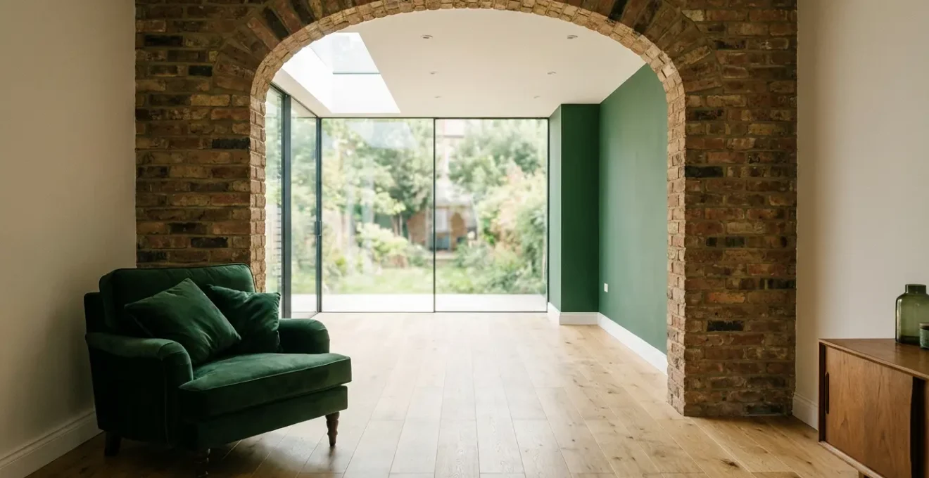
For example, a modern extension might feature a crisp white microcement fascia against the soft grey brick of a Victorian villa, as seen in some successful architectural integrations. This same grey can then be pulled inside—a grey marble countertop in the new kitchen and, in the original living room, a throw blanket or a picture frame in the exact same tone. This creates a visual echo that bridges the architectural gap, turning two styles into one harmonious composition.
Ultimately, this isn’t just about aesthetics; it’s about creating an environment of serene cohesion. The accent color becomes the home’s signature, a unifying element that calms the mind by making the entire space feel intentional and whole.
How to Mix Antique Heirlooms with Modern Sofas Without It Looking Messy?
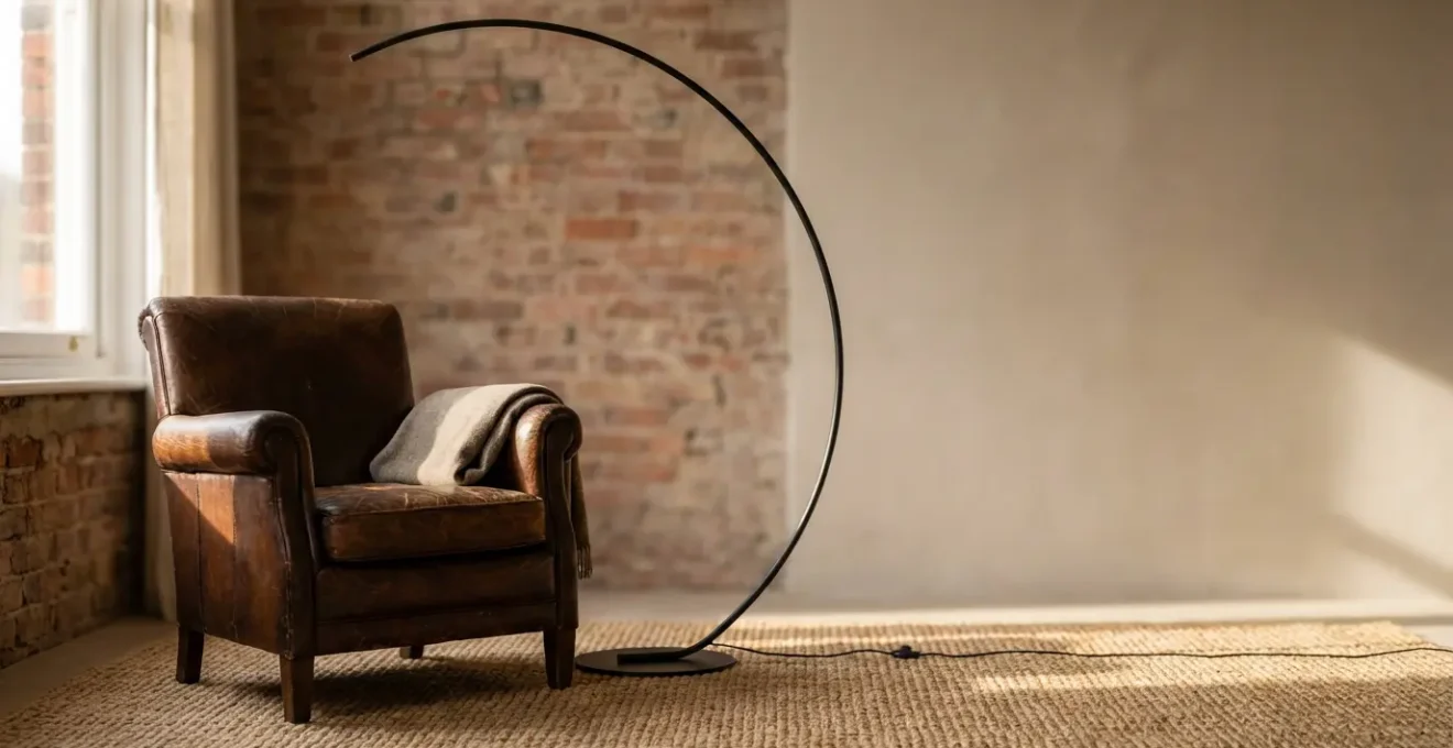
The fear of creating a cluttered, garage-sale look often prevents homeowners from mixing furniture styles. The secret isn’t to avoid the mix, but to orchestrate a “design conversation” between the pieces. This means finding a common ground—a shared color, material, or form—that allows an antique armchair and a modern sofa to coexist harmoniously. For example, a Victorian leather armchair can be paired with a sleek modern arc floor lamp if both share matte black metal finishes. The shared material acts as a translator, allowing two different design languages to communicate.
An architect from a project featured in Homes and Gardens highlights this principle, noting how “the clean lines of the kitchen helped to juxtapose the uneven nature of the older structure.” This intentional contrast, when done thoughtfully, creates a dynamic visual tension that is far more interesting than a perfectly matched room. The goal is balance, not symmetry. Use the 80/20 rule as a guide: in the original part of the house, let 80% of the pieces be period-appropriate, with 20% modern, and reverse the ratio in the new extension.
The space where the old meets the new is your “transition zone.” Here, you can aim for a 50/50 mix and introduce bridge elements—pieces from transitional styles like Art Deco or Mid-Century Modern that inherently blend traditional craftsmanship with modern sensibilities. These items are stylistic diplomats, smoothing the transition between eras.
This comparative table offers a practical framework for achieving this balance. It demonstrates how to adjust the ratio of period to modern pieces across different zones of your home to create a cohesive yet dynamic interior.
| Zone | Period Pieces % | Modern Pieces % | Bridge Elements |
|---|---|---|---|
| Original House Area | 80% | 20% | Mid-Century items |
| Transition Space | 50% | 50% | Art Deco pieces |
| New Extension | 20% | 80% | Contemporary classics |
By treating your furniture not as isolated objects but as participants in a conversation, you can create a rich, layered interior that tells the story of your home’s past and its present simultaneously.
Parallel or Perpendicular: Which Flooring Direction Makes a Narrow Hall Wider?
The direction of your flooring is a powerful tool in manipulating the perception of space, especially in transitional areas like hallways connecting an old house to a new extension. The conventional wisdom is simple: to make a narrow space feel wider, run the floorboards perpendicular to the length of the hall. The horizontal lines trick the eye into seeing more width. Conversely, running them parallel to the long walls will elongate the space, making a short hallway feel longer but a narrow one feel even more constricted.
However, in a home that blends old and new, the goal is not just to alter perception in one area but to create a continuous visual path. The most effective strategy is often to use the same flooring material throughout both the original structure and the new extension. As demonstrated by Cameron Design, using the same hardwood flooring creates a seamless flow that visually erases the threshold between the two zones. If an exact match isn’t possible, large format tiles in a similar tone can achieve a similar effect of visual continuity.
For a more dynamic transition, consider patterns. Recent trends show that designers are increasingly using patterns to create movement and interest. In fact, there was a 45% increase in 2024 in the use of Chevron and herringbone patterns in transition zones. These V-shaped patterns are brilliant for hallways as they create a sense of forward motion, naturally drawing people from the old space into the new. The diagonal lines are more engaging than simple straight planks and add a layer of sophisticated, classic texture that bridges both traditional and modern aesthetics.
Ultimately, the choice between parallel and perpendicular depends on your primary goal. If widening a specific narrow passage is the priority, go perpendicular. But for creating a unified home, prioritize a continuous material and consider a directional pattern like herringbone to guide the way.
The Rug Size Mistake That Makes Your Living Room Look Tiny
The single most common rug mistake is choosing one that’s too small. A small “postage stamp” rug that floats in the middle of the floor with furniture scattered around it visually shrinks a room and makes the space feel fragmented. This is especially damaging when trying to connect an old living area with a new one. The correct approach is to select a rug large enough so that at least the front legs of all major furniture pieces in a seating group are on it. This anchors the furniture and creates a unified, defined zone.
In a transitional space that blends old and new architecture, a large rug can act as a powerful “unifying island.” It should be positioned to physically straddle the boundary between the two zones. By placing a single, oversized rug that extends from the traditional part of the room into the modern extension, you create a visual bridge that physically ties the two areas together. The rug becomes the common ground upon which the “design conversation” between your antique sideboard and your modern sofa takes place.
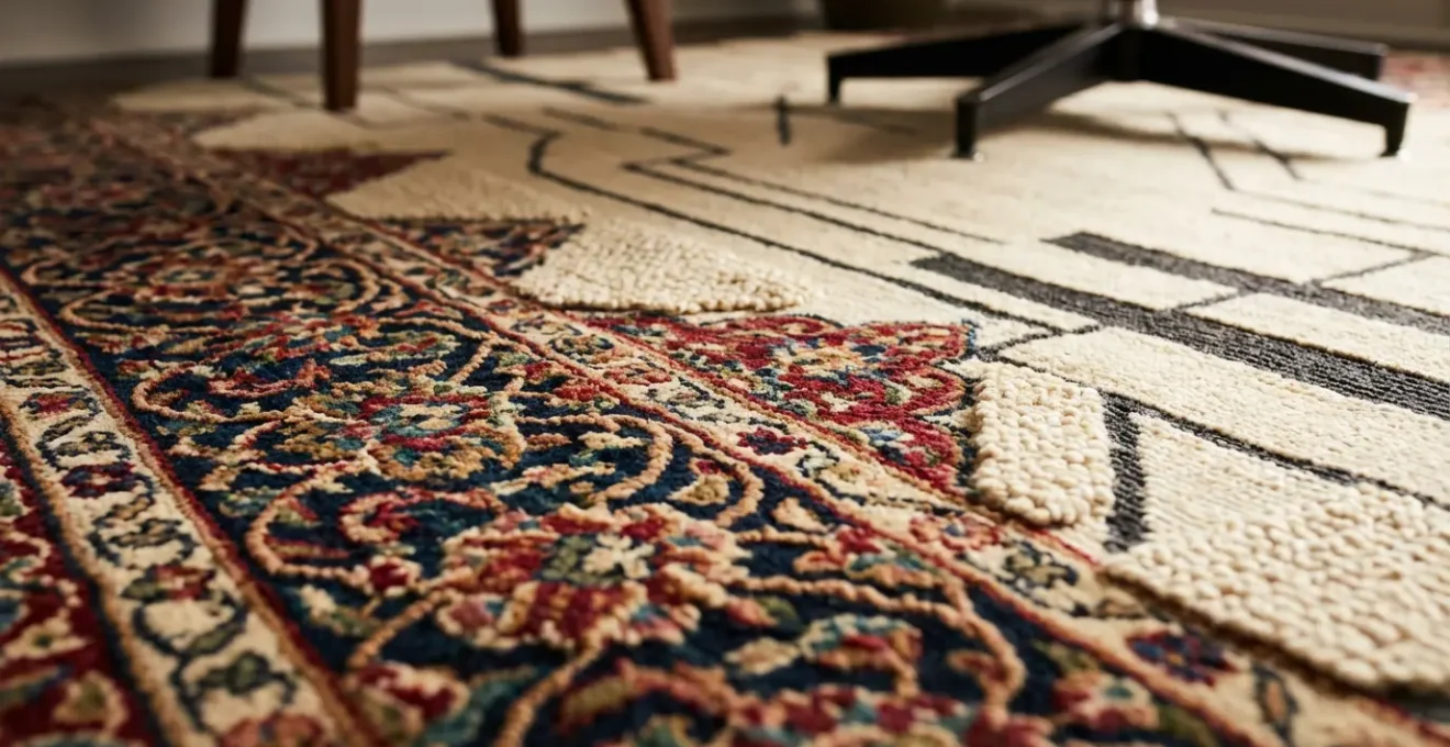
To enhance this effect, focus on textural continuity. Using rugs made of natural woven materials like jute or wool in both the old and new sections—even if the rugs themselves are different—creates a consistent textural palette that reinforces the sense of a single, cohesive home. The texture provides a subtle link that the eye registers as harmonious.
Action Plan: Strategic Rug Placement for Zone Connection
- Measure the Zones: Measure both the old and new living areas to identify the overlapping space where the transition occurs.
- Go Large: Choose a single large rug that extends at least 18 inches beyond the main furniture grouping on all sides.
- Straddle the Boundary: Position the rug to physically cross the invisible line between the original structure and the new extension.
- Complement, Don’t Compete: If using multiple rugs, ensure they share a complementary color palette or style to create defined but connected zones.
- Weave with Texture: Apply natural woven materials like wool, jute, or sisal consistently across rugs in both areas for textural continuity.
By investing in a generously sized rug and placing it strategically, you do more than just decorate the floor. You lay the very foundation for a unified and expansive-feeling living space.
When to Order Custom Curtains: The 8-Week Lead Time Trap?
Off-the-shelf curtains rarely suffice when dealing with the unique architectural challenges of blending an old house with a new extension. Windows often differ in size, height, and style, and using mismatched window treatments can shatter any attempt at creating a cohesive flow. This is where custom curtains become a strategic investment, but one that requires planning to avoid the notorious 8-week lead time trap. You should consider ordering custom curtains as soon as your window measurements are finalized, long before you start painting or moving in furniture.
A brilliantly effective strategy for unifying walls with different window placements is to use one long, continuous curtain track. As one homeowner in a Victorian-era country house did, running a single track from an old window, across a blank section of wall, and onto a new window in the extension creates the illusion of a single, intentional, and unified wall. When the curtains are drawn, the architectural differences disappear, replaced by a seamless plane of fabric. This solution, though requiring a custom track and an 8-week manufacturing time, completely transformed the space’s cohesion.
Another sophisticated approach is to implement a “translucency gradient.” This strategy, used by Urbanist Architecture, involves a progressive shift in fabric weight and sheerness. In the cozy, more traditional rooms, you might use heavy, opulent drapes that pool on the floor, enhancing the sense of history and intimacy. As you move toward the light-filled modern extension, the fabrics become progressively lighter and more sheer. This gradient not only manages the flow of natural light and privacy but also creates a beautiful visual narrative that mirrors the home’s journey from old to new.
While custom curtains require foresight and a larger budget, they offer a level of design control that is unmatched. They can solve complex architectural problems, unify disparate walls, and add a layer of bespoke luxury that elevates the entire home.
Why Sectional Sofas Encourage More Family Interaction Than Separate Sofas?
In the context of a home blending old and new, the choice of a sofa goes beyond mere aesthetics; it’s a decision about how you want the space to be lived in. A sectional sofa, by its very nature, is a unifying force. Unlike a traditional setup of a sofa and two armchairs, which creates formal, separated seating zones, a sectional creates a single, continuous seating landscape. This encourages a more relaxed and communal form of interaction. Family members and guests can lounge, curl up, and share the same space in a more fluid and connected way, fostering casual conversation and togetherness.
This is particularly relevant given that a staggering 87% of home extensions in 2024 feature open-concept designs that merge living, dining, and kitchen areas. In these large, open spaces, a sectional sofa acts as a crucial anchor. It can define the living area without building walls, creating a “room within a room.” When placed strategically, a sectional can also serve as a physical bridge between the old and new parts of the house. By positioning the L-shape to “straddle” the transition line, with one part in the original section and the other in the extension, you create a piece of furniture that literally holds the two spaces together.
The orientation of the sectional is also key. By facing it toward the main sightline that connects both zones—such as a large glass door leading to the garden or a wide opening—you encourage people to look and move through the entire space, reinforcing the sense of a single, large volume. Choosing a neutral fabric that complements both traditional and modern palettes, and then adding accent pillows that pull colors from both the old and new sections, completes the sofa’s role as the ultimate design diplomat in your home.
More than just a piece of furniture, the right sectional becomes the social and visual hub of an open-plan home, encouraging the human connections that truly make a house a home.
Why Living in a Home That Doesn’t Match Your Personality Increases Stress?
Your home is more than a physical structure; it’s an extension of your identity. When your living space is architecturally and decoratively disjointed—a “split-personality” home—it can create a low-grade, chronic source of stress. This feeling of discord arises because the environment is not a true reflection of a unified self. Every time you move between a cozy, traditional room and a stark, modern one, your brain has to process a jarring shift in context. This lack of coherence can leave you feeling subtly unsettled, as if you are living in two different places at once.
As architect Jeremy Smith of Irving Smith Architects states, this is a core challenge for homeowners. In his view, the “old house vs. new extension dilemma is a primary source of stress.” He eloquently captures the essence of the problem and the solution:
The old house vs. new extension dilemma is a primary source of stress: a ‘split-personality’ home. The goal of a coherent design is to resolve this internal conflict and create a single, authentic ‘home personality’
– Jeremy Smith, Irving Smith Architects
This “home personality” is the cohesive narrative you build through design. One powerful way to create this unifying identity is through biophilic design. By consistently using natural materials like wood and stone, maximizing natural light, and incorporating plants across both the old and new sections, you create a theme that transcends architectural style. Nature becomes the universal language that both parts of the house speak. This approach not only provides a calming, unified aesthetic but can also have tangible benefits, such as reducing energy consumption through sustainable design integration.
Resolving your home’s “split personality” is therefore not just an exercise in interior design. It is an act of creating a sanctuary that supports your psychological well-being by providing a stable, coherent, and authentic reflection of who you are.
Key Takeaways
- A unified home is not about matching everything, but about creating a “design conversation” between old and new styles.
- Use a single accent color and consistent textures (like natural woods or metals) as a repeating thread to tie disparate spaces together.
- Large, strategically placed rugs and continuous curtain tracks are powerful tools for physically and visually bridging the gap between two architectural eras.
How to Use Geometric Rugs to Visually Widen a Narrow Living Room?
In the same way that flooring direction can alter perception, the pattern on a rug can be a potent tool for visual manipulation. A geometric rug is particularly effective in a narrow living room or transitional space because its lines and shapes can direct the eye and create an illusion of width. To widen a room, choose a rug with strong horizontal lines or a pattern that emphasizes width over length. Stripes running across the narrow dimension of the room will make it feel substantially wider. Similarly, a pattern of wide, interlocking diamonds or squares can halt the eye’s tendency to rush down a long, narrow space, encouraging it to scan from side to side instead.
This effect is amplified when paired with flooring choices that also promote an uninterrupted visual flow. A recent survey showed that a striking 76.84% of homeowners in 2024 prefer classic floor colors with wide planks. Laying these wide planks perpendicular to the room’s length, and then layering a horizontally-patterned geometric rug on top, creates a powerful one-two punch for maximizing perceived width.
The type of geometric pattern you choose can also help define the character of different zones while maintaining a cohesive feel. A dense, intricate geometric pattern can anchor the traditional section of the house, while a rug with a minimalist linear design can open up the modern extension. In the hallway connecting them, a chevron or herringbone pattern creates a sense of movement, pointing the way from one zone to the next.
This table summarizes how different geometric patterns can be used to achieve specific visual effects and manage the flow between traditional and contemporary spaces.
| Pattern Type | Visual Effect | Best Application | Flow Direction |
|---|---|---|---|
| Dense Geometric | Anchors traditional zones | Old house section | Multi-directional |
| Chevron/Herringbone | Creates movement | Transition hallway | Points to new zone |
| Minimalist Lines | Opens space | Modern extension | Linear flow |
| Oversized Pattern | Unifies zones | Overlapping areas | Breaks boundaries |
Ultimately, a geometric rug is more than just a decorative element; it’s a functional piece of design that can correct architectural flaws and artfully guide the experience of moving through your beautifully unified home.